Close Study Product.
|
General Analysis of OMO advert:
Connotations and Denotations: In the advertisement, the women is photographed in a close up shot with the woman looking over her shoulder. She is made to seem very happy and busy doing the laundry with OMO. This links to the stereotypes of women as they were expected to enjoy doing housework. Furthermore, the clothes hanging on her shoulder are red, yellow (primary colours) and white. The red and white create the same design as the text at the very top of the advert which says 'Whiteness alone won't do!' which promotes the product as the bright colours and white represent OMO's brand. Also, the clothes which are hanging up are white which further encourages the audience to buy this product as the woman seems happy to hang up bright, white clothes. Blue, also a primary colour, has been used as well and could represent freshness. The colour green has also been used in the woman's clothes. Despite the fact that green is a secondary colour, it connotes several things which help promote OMO as a product. In this sense, the colour green could potentially be representing the fact that OMO is safe for the environment and adds freshness to your clothes. The brand name 'OMO' is put in black and very large font. It is also in the colour black creating a juxtaposition between the bright colours in the image of the woman but then putting the title in black, making it stand out and drawing attention to it. |

|

|
Target Audience:
The audience being targeted by this poster would probably be middle aged women in the 1950's (around 40 to 50 years olds). This advert would definitely be appealing in the 50's as it features what every housewife wishes for which is to impress their husband but also enjoy doing work around the house. It also encourages the idea of being glamorous even when doing housework which intrigues women, making them want to buy the product. Alternatively, it could appeal to the husbands of these wives. This could be because of the influence given off by the makeup which makes men think that using OMO would make their wife happier, more stylish and enjoy house work but at the same time, making their clothes look 'whiter' and 'brighter'. |
How is the poster made appealing/convincing?
The very prominent big, black and bold text which says 'OMO makes white brighter' very clearly promotes the product and also creates a sense of competition between OMO and other brands with similar products. The poster is also made more appealing due to the use of a well groomed white, Caucasian woman. Since the woman is Caucasian, has styled, curled hair and heaps of makeup, the advertisement attracts a much larger audience. White people were seen as relatively more superior, wealthy and privileged. This is because during the 50's, ethnic equality was not talked about much thus making society believe that white (Caucasians) were often the best fit and attracted a larger amount of customers.
OMO in relation to theory:
In relation to audiences, I think this particular OMO advertisement would have been made for a large niche audience. It doesn't have the potential to be appealing to a mass audience since the product is meant to interest middle-aged mothers and housewives. In terms of Maslow's Hierarchy, I think the lady in the advert is shown to be quite upper class along with having the responsibility of being a house maker. Despite the slight contrast, ultimately the woman is being shown to as good-looking, happy with her work, doing her work at high standards and most importantly impressing and receiving praise from her husband for using this product and making his clothes brighter than the rest.
What is the stereotype of the role of women in the 1950's?
In the 1950's, women were portrayed in a very stereotypical way. Most women were portrayed as house wives or mothers. This is reinforced by what the women in the poster is doing which is hanging clothes up. This is one of the things that women were automatically expected to do, other things included cooking and taking care of the family. In the 1950's, a majority of the women were thought to be house makers however there was a minority of women who were depicted as having higher statuses. For example, some women did have jobs, despite the fact that they were low class and mostly care giving jobs such as nurses, teachers, secretaries, etc. Some jobs were most efficiently done by women such as sewing and factory working as these jobs required frail and nimble hands. Furthermore, back then, there were very high expectations of women since they were very competitive in terms of receiving praise and also having the best household. This is again portrayed in the poster by the use of the phrase, 'Whiteness alone won't do!' Regardless of the fact that this slogan has been put at the very top of the poster in small but red text, it still represents the nature of women and their perspective on each other back then. In this specific advert, women are shown as having quite low statuses.
How does this stereotype compare with media representations of men and women today?
If we go to compare the way in which women and men are represented currently, it has changed massively.
Galaxy Commercial Analysis
Target Audience
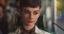
Galaxy in relation to theory: This moving image advert can definitely be associated with Propp’s Narrative Theory. ‘Audrey Hepburn’ could be the potential princess/heroine in this scenario as when she gets off the bus, men around her are impressed by her appearance and confidence. The man could be seen as the hero as he is the one who drives Audrey away from all the chaos. Furthermore, I think the actress would be at stage 4 of Maslow’s hierarchy of needs as she seems relatively privileged however, this is predicted since she is white. I think this because the woman seems fairly confident. This is indicated by her body language and the way she swiftly gets off of the bus and gets into the mans car. We can also see that she is respected by the people around her as everyone’s gaze sets at her when she’s walking to the car. |
Denotations and Connotations
This advert features an Audrey Hepburn look alike because this advert is recent, they have used photoshop to make it seem like it's her however, we know that Audrey Hepburn passed away in 1993. This advert is set in the 1950's and uses the stereotype of women which existed back then. In the commercial, the lady is wearing an elegant looking dress with a tie around her neck making her seem very formally dressed in comparison to the women around her, making her stand out. She is also wearing red lipstick and has her hair up which signifies the importance of her appearance and looking presentable in order to impress men. As she walks out of the bus, the on going argument comes to a pause as all the men around, in the village setting, start to gaze at her. This gives an idea of all eyes being on her which again shows how important appearance was back then and how it determined your status. Another thing which we can interpret from this based on women's status is how hard they have to try in terms of appearance. By looking at how formally the woman is dressed, we can infer that the woman definitely spent time on making herself look appealing whereas, the man who drives in to the scene in a car, is simply wearing a polo shirt with scruffy, messy hair. Unlike the man, the woman has her hair up in a decent, elegant manner. This is clearly reflecting on stereotypes of women in the 1950's because it is referencing to the appearance aspect as well as the fact that women were competitive for praise back then. Another way in which the actor is made to seem graceful is at the end of the moving image advertisement, where the actress very gently, and smoothly bites into the indulgent chocolate. It indicates how delicate the chocolate is as well as the woman considering she uses two fingers to ‘place’ the chocolate into her mouth rather than biting it. If she was to bite, it would take away from the traditional stereotype. Consequently, not as many people would be attracted to the product. |

The way the advert is shot:
It starts off with a shot of the village as a car drives into it. The mountains in the background could potentially be due to the use of green screen considering this advert was only shot recently. Afterwards, a motor bike rider leads the camera's way into the scene of a bus crash with a fruit cart. The camera then is taken into the bus, where we are introduced to Hepburn. As the camera stops at a very close up shot of her face, the music becomes subtle in order to allow the focus to only be on her. However, the camera swiftly moves onto the chocolate in her bag marking the importance of the product. Before she steps out of the bus, she makes eye contact with the man which is followed by the music coming to a stop allowing the audience to engage with the intimacy between Audrey and the man. Her significance is shown again as she steps out of the bus, stops the argument and even makes the bus driver crackle. She proceeds to sit at the back of the car which creates a potential contrast between how she got attention from everybody in the village, yet she chose to sit at the back which could possibly be making a reference to the fact that her status might still be considered low. Hepburn then indulges in the chocolate and seemingly feels relieved. The ending shot is very similar to the one at the start, it just shows the man's car driving off into the mountainous setting.
There is a relation which the video doesn't make too obvious however can be distinguished. This relation is the one between Hepburn's transition from the bus to the car and the message at the end of the advert, 'Why have cotton when you can have silk?' The message being conveyed is that why sit and ride a bus with strangers when you could ride a luxurious car. Of course, with Audrey being portrayed alongside the stereotype of women - excessive makeup, hair tied up, decent - she is likely to be able to get a ride from the 'hero'. Also, the message at the end of the video gives a very similar message however, this time, it relates to the product being sold. The message tells the audience, why have other chocolate bars (cotton) when you can have galaxy (silk).
Peer Feedback by Vinomin M
WWW: The piece of writing is quite good. The first analysis is spot on
EBI: Some errors are present. Specify more in detail (second one)
Refer to theory such as Maslow's hierarchy
Comparison of OMO and Galaxy advertisements:
Despite the fact that both adverts are portraying women in the 1950's, I think they're both very different. Firstly, the OMO advert is a still image and the Galaxy one is a moving image advert. They're both portraying women in different ways. For example, the main message being conveyed in the OMO advertisement is that women should do house work such as cleaning clothes. In addition, do other work around the house as well in effort to make everything seem perfect which is where the competition aspect amongst stereotypical British women in the 1950's comes in. However, in the Galaxy advertisement, the Hepburn look-alike is portrayed to be elegant, gracefully and formally dressed. She is shown to be respected greatly by the ones around her but since nobody else is visible in the OMO ad, we don't have a lot to assume from except for her short, curly hair and the makeup.
The makeup is one of the main similarities. In both ads, the women have excessive amounts of makeup on and both have a smile on their face. This implies that the products are being classified as something that women in the 1950's would need in order to feel beautiful, happy and content with their life. Therefore, both adverts attract women/housewives of different age groups (middle-aged and 20+) with the implication that they can be happy by using the finest, whitest washing powder and eating the silkiest, smoothest chocolate bar.
Represent CSP
Represent was made as an advert - featuring Lady Leshurr who is a British rapper - and encourages people in the UK who are part of the BAME community to donate blood. The advert features lots of statistics as well as lyrics which are there to make the viewer feel touched and consequently, feel the need to donate blood.
Denotations and connotations
In this advert, Lady Leshurr uses the form of rapping, to convey the message that NHS is trying to give, which is quite unusual however, it is what separates other adverts from this making it unique and appealing to the modern day generation. She starts off by listing lots of things which you can do/can be. She mentioned occupations like such:
'You decide to be a pilot and fly private'
'A boxer in the ring and you fight till your eyes violet'
'You could be an artist painting a vivid image'
She then goes on to mention things which the BAME community have done:
'We are the ones making policies'
'We are the scientists who create magic in the laboratories'
By mentioning a list of these two things, Lady Leshurr builds up a sense of hope for the viewers which would make them feel relieved. However, she puts this to an end with the phrase 'But we ain't representing in other ways like giving blood to make another see better days.' This is where she takes it all away and makes the audience feel guilty for not giving blood and therefore, making others suffer. This is followed by a statistic which stated that only 3% of total blood doners come from the BAME Community which would disappoint the viewer even more. Hence why the BAME needs more blood doners to save the lives of those who are of a similar ethnicity and rare blood types (eg. AB negative and AB positive which is found mostly in Asians).
|
What does BAME stand for?
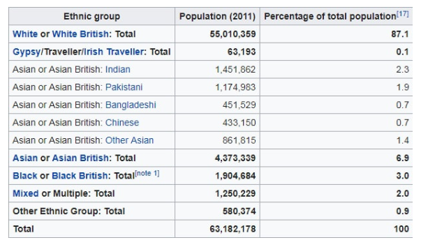
BAME is a term which is used in the UK and refers to Black, Asian and Minority ethnic people. The percentage of BAME people (13%) in the UK is quite relevant to this video because it is conveying that Caucasians shouldn't be the only ones donating blood solely due to the fact they make up a majority. Why is there a need for for blood doners in the BAME Community? There is a need for blood doners in the BAME community in order for the NHS to make sure that all patients, of all enthnicities are getting treated. This is usually done to its highest standard when the right blood types are readily available, which is only possible if the 3% of BAME blood doners increase. Therefore, blood is needed so everybody can be healthy with the exact blood type from someone of a similar background, if a transfusion is needed. |
|
|
|
