Codes and Conventions in Media:
Masthead: title of the magazine. It is often found at the top of the first page and is made to be bold so it stand out.
Primary/Main image: the main image on the front cover and also the image which the buy lines refer to; it is taken by the magazine itself therefore, called a primary image.
Sell/Buy lines: putting the main ideas and contents of the magazine around the main image. Usually, on English magazines, most of the text is on the left since English is written and read from left to right.
House style: having a theme on your front page which is then relevant to what the magazine contains.
Direct address: having the model look directly at the reader which helps the reader engage as well as making them feel like the magazine is personal to them.
Typography: Having the brand name of the magazine bold and prominent in comparison to other texts.
Bar-code/Date/Issue: An issue date to ensure that people are buying the latest versions of the magazine. A bar-code for the price.
Camera angles: describes the type of shot which has been used for the images in a magazine, these are chosen strategically in order to enhance the appearance of the model.
Verbal cues: messages in the magazine which are shown through the text on the magazine.
Non-verbal cues: messages which are not obvious tend to be shown through the use of photos and imagery.
Colour Palette: the range of colours which has been used in the magazine; it could represent the house style of the magazine or it could set the mood for the contents of the magazine.
Layout/composition: the format in which the buy lines, the masthead and the main image has been placed; this also includes what is made to stand out more and what isn't.
Photographic cues: messages given off through the photos found in the magazine.
|
Magazine Cover Analysis
Basic Facts about VOGUE Magazine: VOGUE Magazine targets women of ages 25-54 as a lot of its contents talk about things such as anti-ageing, the latest fashion events, trending actresses (occasionally actors). A majority of VOGUE's audience is female. 77% of their audience is female meaning 23% is male. This is also reflected through what is found on/in their magazines which is usually content related to women. A large fraction of Vogue's front covers have a female model on them, such as the one below, featuring Carey Mulligan and the ones on the right. Only 8 men have ever been on VOGUE's front cover, and those have also been featured alongside women. For example, Gigi Hadid has been on the front cover alongside Zayn Malik and Ashton Eaton (two of the 8 men). The people who read VOGUE are of all different ages, but mainly younger individuals.
VOGUE has a total circulation of 1.2 million. Some other statistics tell us what social class VOGUE's readers belong in, these are the following: People who have subscribed ~
|


|


|

|
May 2016 Issue
This is the May 2016 issue from Vogue, based on Carey Mulligan and her role in a new movie. Mulligan is thought to be a woman who goes against the general stereotype due to her controversial thoughts about the roles of women in movies. She is presented sexually as well as innocently. Her facial expression makes her look very innocent and more so of an 'angel' however her low, revealing and red dress portrays the opposite. We know that the colour red generally tends to attract more men as it makes the woman look fierce. Taking Mills Male Gaze concept, Carey Mulligan is being presented more sexually through her facial expressions, her her being tied up, a lot of her chest area being exposed and also her extremely lady-like way of sitting, thus attracting men for her qualities. However, her makeup is very subtle and there isn't much which is one of the things that goes against the typical stereotype of women on magazines. Masthead: large, bold colour (red) making it stand out. Side/buy-lines: The main contents of the magazine are stated on the left. Anchorage text: The anchorage text refers to Carey Mulligan. It compliments her acting in the romance movie 'Far from the madding crowd'. The phrase 'Ravishing!' is in black and bold to make the model's qualities stand out. Also Carey Mulligan's name has been put in bold as well as the colour red to draw the reader's attention. It has also been placed on the left hand side in order to attract more readers as they see her name. |
Barcode/Date: The barcode has been placed at the bottom left along with the price. The issue which is May, 2016 is under the masthead, bottom right corner, in extremely small and black text.
House style: This magazine follows the typical house style of vogue, which is most often having the masthead underneath the head of the model. Also, most vogue magazine covers have colour palette of mostly warmer tones rather than brighter colours, and this cover also follows that by the use of red and black; two contrasting colours.
Colour Palette: The model seems to look quite pale however, the masthead and buy lines are put in a very bright red to create a slight contrast.
Typography/Text/Layout: There is lots of text on both sides of the image and the masthead is placed under the model's head however, the buy lines have been strategically placed over the model but do not cover any parts of her dress or face. All text on the front cover has been put into capital letters so in order to differentiate from the more significant details, some text has been put in a larger font such as the phrase 'Spring Into Style' in order to put more emphasis on it.
Camera angle/direct address: The main image has been taken as a mid shot. It doesn't show anything below her waist other than her dress. The model is also making eye contact with the reader which helps the reader engage and also attracts men (male gaze theory).
CSP-Tatler
|
Conde Nast:
Conde Nast is an American media company that publishes magazines. They own 27 different magazines which are published and read by people globally. It was founded in 1909. However, despite owning so many other magazines, Tatler is the classiest as well as wealthiest of them all. It gets published monthly and is sold for £2.42, which is a lot compared to the standard magazine price (for gossip, men, sport, etc. magazines) in the UK which is around 1 to 2 pounds. In Oman, it is sold for approximately 5-7 OMR which is almost 10-15 GBP. Tatler has an international readership of 164,000 and a circulation of 1 million (combining print and digital) however, Tatler UK has a circulation of 77,343 and a readership of 199,000. 83% of buyers of Tatler are women and 27% are men. Many men work in the fashion industry and could potentially be interested in a magazine such as Tatler. All of Tatler's magazines feature insights on high society and the latest political stories as well as what most magazines cover which is fashion and lifestyle. Since it is a British magazine, it focuses on wanting its audience to be high class and rich. The average age of Tatler readers is 41. However, there is a large variation in the age of people who read Tatler: Ages 15-24: 22% (36 000) Ages 25-34: 20% (32 000) Ages 35-44: 18% (29 000) Ages 45+: 40% (66 000) |
They own:
|
|
Tatler - Georgina Bevan
Codes and conventions on Georgina Bevan's issue of Tatler
Codes and conventions on Georgina Bevan's issue of Tatler

Other Magazines by Conde Nast:
Conde Nast publishes a range of other magazine which all have a very similar layout; the house style. such as a bold, visible mast head, sell lines, an attractive main image, etc. However, they all target different audiences which allows Conde Nast to cover almost all possible audiences. For example, a magazine like the one above, Tatler, targets higher class mostly female but some male individuals therefore, using language which is understood by these upper class people. People who read Tatler would be known as 'Aspirers' because they aspire to be like the upper class, rich people featured on these magazine and have nothing against investing more money to be seen as stylish and having high status. Alternatively, magazines such as Golf World and GQ are aimed specifically at men; GQ gives advice on things such as men's fashion, men's culture and men's style. Also, Golf World focuses on main events in the world of golf such as tournaments, winners, etc. On the other hand, magazines like Glamour are aimed towards a younger, teenage and female audience who are interested in learning new things about make-up and just being in with the latest trends. People who read Glamour would be 'Explorers' because they'd want to use things/products recommended by beauty gurus (eg. Zoella on Glamour's spring issue). But then, a magazine like Vanity Fair would be aimed at 'Succeedors' since the contents are appropriate for an older audience therefore, people who are upper class and have a stable household would read a magazine like Vanity Fair.
Conde Nast publishes a range of other magazine which all have a very similar layout; the house style. such as a bold, visible mast head, sell lines, an attractive main image, etc. However, they all target different audiences which allows Conde Nast to cover almost all possible audiences. For example, a magazine like the one above, Tatler, targets higher class mostly female but some male individuals therefore, using language which is understood by these upper class people. People who read Tatler would be known as 'Aspirers' because they aspire to be like the upper class, rich people featured on these magazine and have nothing against investing more money to be seen as stylish and having high status. Alternatively, magazines such as Golf World and GQ are aimed specifically at men; GQ gives advice on things such as men's fashion, men's culture and men's style. Also, Golf World focuses on main events in the world of golf such as tournaments, winners, etc. On the other hand, magazines like Glamour are aimed towards a younger, teenage and female audience who are interested in learning new things about make-up and just being in with the latest trends. People who read Glamour would be 'Explorers' because they'd want to use things/products recommended by beauty gurus (eg. Zoella on Glamour's spring issue). But then, a magazine like Vanity Fair would be aimed at 'Succeedors' since the contents are appropriate for an older audience therefore, people who are upper class and have a stable household would read a magazine like Vanity Fair.

|
|

|

|
Hearst Magazines
CSP-Reveal
|
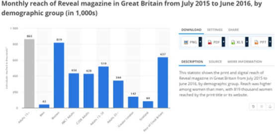
Reveal Magazine is a gossip/drama magazine. It is published in the UK and is described by Hearst as "the reader's best friend: fun, gossipy and full of advice on everything from fashion and beauty to diets and cocktails." This statement suggests that the audience being targeted primarily consists of relatively younger females. By observing the graph on the right, we can see that the readers of Reveal include 819 000 adult women. 519 000 readers are aged 15-24 and as stated in the image, the reach of Reveal was higher among women than men.
Reveal is the exact opposite of Tatler. Each issue costs either 99p or £1 however, Tatler on the other hand costs £3 creating quite a vast difference in price points. Therefore, Reveal is more likely to be bought by middle and skilled working class since they would be unable to afford high end magazines, such as Tatler. Reveal is issued every week. On issues of Reveal, several images, mainly off guard pictures of celebrities, are scattered in addition to a a large amount of text including insider information such as celebrity love lives, pregnancies, marriages, etc. However, on a magazine like Tatler, one main image is used with a famous celebrity who is paid and taken photos of during a professional photoshoot therefore, making it more expensive and classier. Tatler also focuses on setting a theme to each of their covers rather than contributing several ideas such as Reveal which refers to lots of events on its front cover. Also, Reveal displays the occurrence of several different events to attract as many readers as they can. For example, some readers may feel interested in a celeb's love life whereas, others may be interested in the wedding preparations of two celebrities. Furthermore, the events mentioned use quite common British celebrities which makes the magazine understandable for a vast majority of the British population whereas, Tatler specifically targets upper class readers with the use of elegant and advanced language such as the noun 'Sloane' which would easily be acknowledged by an upper class woman, but not people in lower classes, |

|

|
Analysis of Reveal
Masthead: quite large, white text with red backing, overlapped with images suggesting that it is quite recognizable even with some parts of it being covered. Sell lines: yellow, white, large and bold to catch the reader's eyes, some sell lines are larger to make it seem like the main headline. Anchorage text: the biggest image on the cover is of a Peter Andre on the phone and Kate Price n sunglasses and has large, bold, yellow text over it however, no specific anchorage text. Barcode/Date: a fixed price of 99p is placed on the cover, very large, eye-catching to attract more customers, a small camouflaged barcode can also be seen at the bottom right of the cover, date of issue is not mentioned on the front cover. House style: each issue has a very distinct style; scattered images and text, different sizes of font potentially displaying the importance of the event, brightly coloured text, off-guard/paparazzi pictures of well-known celebrities. Colour palette: bright colours to attract readers. Typography/Text/Layout: the layout of the covers are always very messy and all over the place which represents Reveal's target which is to be the reader's 'best friend'. The text size varies and the font for different sell lines seems slightly different. On typical magazines, most sell lines are towards the extreme left/right however, on Reveal, they are scattered all over. Camera angles: the purposes of the images is not to make the celebrities look flatter and is actually intended to expose them therefore, camera angles cannot be used to explain the images as they are all different and captured by the press. |
Differences & similarities between Tatler and Reveal Magazine

|

|
|
|
